-
Architects: Ah Asociados
- Area: 23178 m²
- Year: 2016
-
Photographs:Rubén P. Bescós
-
Manufacturers: Alucoil, Aislatec, Astrawall Ibérica, Industrias Cirauqui, Montejo, Second Office Spain


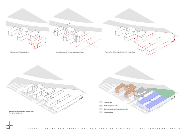
Text description provided by the architects. This action has been carried out over a building designed by Víctor Eusa in 1935. It was completed in 1943. This modern landmark originally consisted of a main axis and two wings where the architectural program was developed. In the south of this comb figure hospitalization units were placed. In the north the obstetric unit and the chapel almost completed a third wing. The east-west axis ended against a cloister containing a residence for friars and several other support facilities surrounded by garden areas. The hospital was located outside the urban fabric of Pamplona, over a promontory overlooking the plain of the Arga River, the old town with the cathedral towers and the distant landscape.


As years passed by, the original design was slowly distorted. The enlargement of the hospital program caused important dysfunctions. Increasing incidence of cars and other means of road transport had the effect of replacing garden area by parking area and thus deteriorating its image. Finally, the expansion of the city enveloped the hospital in a low density residential neighbourhood.

Considering all these circumstances, the architectural project is aimed towards the recovery of the original values of the building. First, recovering of the old plan criteria enables a harmonic image of both the new and the refurbished building. This also allows a displacement of the relationship between building and its urban surroundings towards the forefront sides of each block the same way it happened in the original building. Second, the comb shaped plan has also a positive impact in urban landscape because the perceived volume is smaller than the real one. This was a key point in the new design because of the low density and mainly single family house area in which the hospital is now located. And third, once the forefront of the plot would become free of the parking space, the hospital is understood as a group of pavilions surrounded by garden areas.

A historical research on pictures and elevations of the former building shows both a will of reinforcing horizontal lines and a graceful expressionism in the use of brick walls combined with framed windows.
Unfortunately, these values have been lost as time has gone by. Several decisions were taken in order to recover that initial appearance. The added sloped tile cover was eliminated, dramatically changing the image of the building. As for the extension, it was designed a new aluminum profiled sheet covering which combine two different profiles in order to create a vibration over the façade. This way, raw tectonic of these profiles is shown but several other effects are accomplished. It can be perceived a horizontal outline equivalent to the one seen in the building by Eusa. Besides, the building obtains a great expressive strength, paradoxically linked to a certain amount of brightness which eases the great volume of the new wings to don’t overcome its surroundings.


